LifeStyle Renovations Blog
Color, Layouts, and Mood: How Design Choices Influence the Feel of Your Home

Color has the power to completely change the way a home feels. It can make a room feel calm, bright, cozy, bold, elegant, spacious, welcoming, dramatic, or relaxing. While many homeowners think of Color as a finishing detail, it is actually one of the most important design decisions in any renovation. The colours you choose for your walls, cabinets, flooring, tile, furniture, and accents can influence mood, highlight architectural details, support the function of each room, and help your home feel more connected from one space to the next.
At LifeStyle Renovations, we understand that home design is about more than choosing materials that look nice. A successful renovation should support the way you live every day. It should feel comfortable, practical, and personal. Color, lighting, and layout all work together to create that experience. When these elements are planned with intention, your home becomes more than a collection of renovated rooms. It becomes a space that feels balanced, functional, and aligned with your lifestyle.
Whether you are planning a kitchen renovation, bathroom remodel, basement development, living room update, bedroom refresh, or full home renovation, Color should be considered early in the design process. The right Color choices can make small rooms feel larger, dark rooms feel brighter, open spaces feel connected, and busy family areas feel more organized. The wrong choices can make a space feel cold, cramped, unfinished, or disconnected from the rest of the home.
Understanding how Color affects mood and how layout influences behaviour can help you make better renovation decisions. It can also help you create a home that feels as good as it looks.
Why Color Matters in Home Renovation
Color is one of the first things people notice when they walk into a room. Before they focus on the flooring, furniture, cabinets, or lighting, they often respond emotionally to the overall feeling of the space. That feeling is strongly influenced by Color.
A soft neutral room may feel calm and timeless. A deep blue room may feel intimate and grounded. A warm beige or taupe may feel cozy and inviting. A bright white kitchen may feel clean and open. A rich green accent wall may bring a sense of nature and character into the home.
Color also affects how we perceive size and light. Lighter colours can help a room feel larger and brighter, especially when natural light is limited. Darker colours can make a room feel more dramatic and cozy, but they need to be balanced with proper lighting and thoughtful placement. Warm colours can create energy and comfort, while cooler colours can feel calm and refreshing.
In renovation design, Color is not only about personal taste. It is also about function. A busy family kitchen may benefit from warm, durable, easy-to-live-with colours. A primary bedroom may need a calming palette that supports rest. A basement may require lighter tones and layered lighting to prevent it from feeling dark. A bathroom may need colours that feel clean, fresh, and relaxing.
When Color is chosen with purpose, every room works better.
The Psychology of Color in the Home
Color psychology looks at how different colours can influence emotions, behaviour, and atmosphere. While personal preference, culture, lighting, and surrounding materials all affect how a colour is experienced, there are general associations that can help guide home design decisions.
Blue is often associated with calm, trust, and relaxation. It can work beautifully in bedrooms, bathrooms, offices, and quiet living areas. Soft blues can make a room feel peaceful, while deeper navy tones can add sophistication and depth.
Green is connected to nature, balance, growth, and renewal. It can bring a grounded, organic feeling into a home. Soft sage, olive, forest green, and muted green-gray tones are popular choices for bedrooms, kitchens, bathrooms, and feature walls.
Yellow is often linked with warmth, happiness, and energy. Used carefully, it can brighten a kitchen, breakfast nook, laundry room, or children’s space. However, very strong yellow can feel intense, so softer shades or accents are often easier to live with long term.
Red is bold, energetic, and attention-grabbing. It can add warmth and drama, but it is usually best used in smaller amounts, such as decor, artwork, dining room accents, or statement pieces.
Orange combines warmth and energy. It can feel friendly and creative, especially in family rooms, hobby rooms, or social spaces. Like red, it is often most successful when used as an accent rather than the dominant Color.
Purple can feel creative, luxurious, or calming depending on the shade. Soft lavender may feel gentle and restful, while deep plum can add richness and drama.
Black adds elegance, contrast, and definition. It can make a space feel modern and polished when used thoughtfully. Too much black without enough light can feel heavy, but black accents in hardware, fixtures, doors, tile, or cabinetry can create a strong design statement.
White feels clean, bright, and open. It is a popular choice for kitchens, bathrooms, trim, ceilings, and modern interiors. However, not all whites are the same. Some have warm undertones, while others feel cooler or more crisp. Choosing the right white is important.
Neutrals such as beige, taupe, gray, cream, and greige create flexible backgrounds that work with many design styles. They are especially useful in open-concept homes because they can connect different rooms without overwhelming the space.
Choosing Color Based on the Room’s Purpose
Every room in your home serves a different purpose, and your Color choices should support that purpose. A colour that works beautifully in a powder room may not be the best choice for a kitchen. A dramatic feature wall that looks stunning in a dining room may feel too heavy in a small basement bedroom.
Before choosing paint, tile, cabinets, or finishes, think about how the room will be used. Is it a place for rest, activity, entertaining, working, cooking, bathing, or gathering? Should the room feel calm, energetic, polished, cozy, cheerful, or luxurious?
A family room should usually feel comfortable and welcoming. A kitchen should feel functional, bright, and inviting. A bathroom should feel fresh and relaxing. A bedroom should support rest. A home office should encourage focus. A basement should feel warm and connected to the rest of the home.
Color should always support the purpose of the space. This is one reason why working with a renovation team can be helpful. A professional design approach considers not only what looks good in a sample or inspiration photo, but how the Color will actually feel in your home.
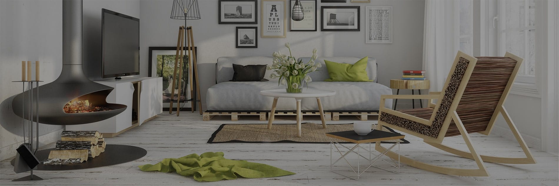
Color for Living Rooms and Family Rooms
Living rooms and family rooms are often the heart of the home. These spaces need to feel comfortable, flexible, and inviting. They may be used for relaxing, watching television, entertaining guests, reading, playing games, or spending time with family.
Neutral colours are a strong choice for living rooms because they create a flexible foundation. Warm whites, soft beiges, greige, taupe, and light gray can all work well depending on the style of the home. These colours allow furniture, artwork, rugs, and decor to bring in personality.
If you want more depth, consider adding Color through an accent wall, fireplace surround, built-in shelving, or furniture. Deep blue, warm green, charcoal, terracotta, or rich brown can create a cozy and stylish look without overwhelming the room.
Texture is also important. A neutral room can still feel interesting when it includes layered materials such as wood, stone, woven fabrics, soft upholstery, metal finishes, and patterned rugs. Color does not have to be loud to create impact.
In open-concept homes, the living room Color should connect with the kitchen, dining area, and hallway. The palette does not need to match exactly, but it should feel harmonious.
Color for Kitchens
Kitchen Color choices have a major impact on the overall feel of the home. Because kitchens are busy, high-use spaces, the palette should balance beauty, function, and long-term appeal.
White kitchens remain popular because they feel bright, clean, and timeless. However, all-white kitchens can sometimes feel flat if there is not enough warmth or contrast. Wood accents, warm lighting, textured backsplashes, natural stone, or contrasting hardware can help soften the look.
Two-tone kitchens are another strong option. For example, light upper cabinets paired with darker lower cabinets can create depth while keeping the room bright. A navy, green, charcoal, or wood-toned island can add personality without making the entire kitchen feel dark.
Warm neutrals are also becoming more popular in kitchen design. Cream, mushroom, taupe, soft beige, and warm gray can create a welcoming atmosphere that feels less stark than pure white.
Backsplashes are a great place to introduce Color. Soft blue tile, green handmade-style tile, warm neutral stone, or patterned tile can add character while still keeping the kitchen practical. Cabinet hardware, pendant lights, stools, and decor can also bring in smaller touches of Color.
The key is to choose a kitchen Color palette that works with your flooring, countertops, cabinets, lighting, and the rest of the home.
Color for Bathrooms
Bathrooms are smaller spaces, but Color still plays a major role. The right palette can make a bathroom feel clean, calm, bright, and spa-like.
Light colours are often used in bathrooms because they help the space feel open and fresh. Soft whites, pale grays, warm creams, light blues, and muted greens can all work beautifully. These colours pair well with tile, stone, glass, mirrors, and polished fixtures.
For a more luxurious look, deeper colours can be used carefully. A dark vanity, deep green wall, navy tile, charcoal floor, or black fixtures can add sophistication. In a powder room, homeowners often have more freedom to use bold Color because the space is smaller and separate from the main living areas.
Bathrooms also need good lighting. A Color that looks beautiful in natural daylight may look very different under artificial lighting. This is especially important near mirrors, where lighting affects how paint, tile, and finishes appear.
If you are renovating a bathroom, test colours with your tile, vanity, countertop, flooring, and lighting before making final decisions. Small undertone differences can become very noticeable in a finished bathroom.
Color for Bedrooms
Bedrooms should feel restful, comfortable, and personal. Since this is where you begin and end the day, Color should support relaxation.
Soft blues, muted greens, warm neutrals, gentle taupes, creamy whites, and soft grays are common bedroom choices because they create a calming atmosphere. These colours can be layered with textiles, bedding, curtains, artwork, and furniture to create depth.
Darker bedroom colours can also work well when used intentionally. Deep navy, forest green, charcoal, plum, or warm brown can make a bedroom feel cozy and cocoon-like. This can be especially effective in larger bedrooms or rooms with good natural light.
If you prefer a brighter bedroom, keep the main walls neutral and add Color through bedding, pillows, artwork, or an upholstered headboard. This makes it easier to update the room later without repainting or changing major finishes.
The bedroom should feel connected to your personal style, but it should also feel peaceful enough to support rest.
Color for Basements
Basements need special Color consideration because they often have less natural light than the upper levels of the home. A poorly chosen basement Color palette can make the space feel dark, cold, or disconnected. A thoughtful palette can make it feel warm, comfortable, and fully finished.
Lighter colours are often useful in basements because they reflect more light. Warm whites, soft beige, pale greige, light gray, and muted earth tones can help the space feel brighter. However, this does not mean every basement has to be plain or white.
Accent colours can add personality and warmth. A deep feature wall behind a media unit, a rich cabinet colour in a wet bar, or warm wood tones in shelving and flooring can make the basement feel inviting. The key is balance.
Lighting should be planned alongside Color. Recessed lights, lamps, sconces, under-cabinet lighting, and dimmers can all help bring the basement to life. A basement with good lighting can handle more Color than one that relies on a few overhead fixtures.
For family rooms, home gyms, guest suites, playrooms, and entertainment areas, the Color palette should support the way the basement will be used.
Color for Home Offices
A home office should support focus, productivity, and comfort. The best Color choice depends on the type of work being done and the mood you want to create.
Soft blues and greens can help create a calm, focused environment. Warm neutrals can feel grounded and professional. Deeper colours such as navy, charcoal, or forest green can create a polished office look, especially when paired with good lighting and wood furniture.
For creative workspaces, small doses of brighter Color may be helpful. Artwork, shelving, accessories, or a feature wall can bring energy into the room without becoming distracting.
If your office is used for video calls, consider how the wall Color looks on camera. A clean, balanced background can make the space feel more professional. Lighting also matters, since Color can shift depending on the direction and quality of light.
How Layout Influences the Way a Room Feels
Color is powerful, but it does not work alone. Layout also influences mood, behaviour, and comfort. A beautiful Color palette cannot fully solve a room with poor flow, awkward furniture placement, or cluttered pathways.
A good layout makes a room easier to use. It guides movement, creates zones, supports conversation, and helps each area serve its purpose. In a renovation, layout decisions often matter as much as finish selections.
For example, an open kitchen with a large island may encourage gathering and entertaining. A basement divided into clear zones may support family movie nights, play areas, storage, and guest space. A living room with furniture arranged for conversation may feel more welcoming than one where every seat faces only the television.
Layout also affects how Color is experienced. A dark wall at the end of a hallway may create depth. A lighter Color in a narrow room may make it feel more open. A consistent neutral palette in an open layout may help the home feel connected.
When Color and layout work together, the whole space feels more intentional.
Creating Flow from Room to Room
One of the biggest challenges in home renovation is creating flow between spaces. This is especially important in open-concept homes, main floor renovations, and homes where several rooms are being updated at once.
Flow does not mean every room has to be the same Color. Instead, it means the colours should relate to one another. You can create flow by repeating undertones, using a consistent trim Color, choosing complementary finishes, or carrying one accent Color throughout the home in different ways.
For example, a warm neutral wall Color may continue through the main floor, while the kitchen island, living room pillows, and dining room artwork bring in variations of blue or green. This creates connection without repetition.
In a whole-home renovation, a Color palette should be planned as a complete story. The entryway, kitchen, living room, bathrooms, bedrooms, basement, and exterior should feel like they belong to the same home.
The Role of Lighting in Color Selection
Lighting can completely change how Color appears. A paint colour that looks warm and soft in one room may look dull, yellow, blue, or gray in another. This happens because natural light, artificial light, shadows, window direction, and surrounding finishes all affect how Color is perceived.
Rooms with strong natural light can often handle cooler or deeper colours. Rooms with limited natural light may need warmer or lighter tones to avoid feeling flat. North-facing rooms can sometimes make colours look cooler, while south-facing rooms often bring out warmth.
Artificial lighting also matters. Warm bulbs can make colours feel softer and cozier. Cooler bulbs can make colours feel brighter and crisper. This is especially important in kitchens, bathrooms, basements, and home offices.
Before choosing a final Color, look at samples in the actual room at different times of day. Place samples beside flooring, tile, countertops, cabinets, and furniture. A Color should be chosen in context, not from a tiny sample alone.
Using Accent Color Without Overwhelming a Room
Accent Color is a great way to add personality to your home without committing to bold colours everywhere. Accent Color can appear in many forms, including painted walls, tile, cabinetry, furniture, artwork, rugs, lighting, pillows, doors, and decor.
The best accent colours are intentional. They should support the room’s mood and connect with the rest of the design. Too many unrelated accent colours can make a room feel busy. A small number of repeated accent colours can make the home feel polished.
In a kitchen, an accent Color might be used on the island. In a bathroom, it might appear in the vanity or tile niche. In a living room, it might appear through pillows, artwork, or a feature wall. In a basement, it might define the media area or bar.
Accent Color is also easier to update than major finishes. If you like changing decor seasonally, keep permanent finishes more neutral and use accessories to bring in fresh Color.
Neutral Color Does Not Have to Be Boring
Many homeowners worry that neutral colours will feel plain. In reality, neutral Color palettes can be warm, layered, and full of personality when they are designed well.
The key is variation. A room with warm white walls, wood flooring, cream upholstery, textured rugs, black hardware, stone accents, and soft lighting can feel rich and inviting even without bold Color. Neutrals create a calm foundation that allows materials and architectural features to stand out.
Neutral Color also has long-term flexibility. It can work with changing furniture, seasonal decor, artwork, and personal style. This makes it a practical choice for larger renovation investments such as cabinets, flooring, tile, and countertops.
Warm neutrals are especially useful in Calgary homes because they can create a cozy feeling during colder months while still keeping rooms bright and fresh.
Bold Color Can Add Character
While neutrals are versatile, bold Color can bring energy and personality into a home. The key is using it with purpose.
Bold Color works well in spaces where you want impact. Powder rooms, dining rooms, mudrooms, offices, laundry rooms, feature walls, and built-ins can all handle more dramatic choices. A deep green powder room, navy office, terracotta mudroom, or charcoal media wall can make a home feel custom and memorable.
Bold Color should be balanced with the rest of the design. If the walls are dramatic, keep some surrounding finishes quieter. If the cabinetry is bold, choose countertops, flooring, and backsplash materials that support the look rather than compete with it.
The best bold Color choices still feel connected to the home’s overall palette.
Color and Renovation Value
Color can also affect how updated and market-ready a home feels. While personal style is important, homeowners planning to sell in the future may want to choose colours with broad appeal for major renovation elements.
Neutral walls, classic cabinetry, natural materials, and balanced lighting tend to appeal to more buyers. This does not mean the home has to feel generic. Personality can be added through accents, furniture, art, and decor.
For long-term renovation value, consider using more timeless Color choices for expensive or permanent features such as cabinetry, tile, countertops, flooring, and exterior finishes. Bolder colours can be used in areas that are easier to change later.
A well-planned Color palette can make a renovation feel current, comfortable, and enduring.
Common Color Mistakes to Avoid
One common mistake is choosing Color too early without considering lighting, flooring, cabinets, countertops, or furniture. Paint is often easier to change than tile or cabinetry, so it should work with the fixed finishes.
Another mistake is using too many colours without a clear plan. A home can feel disjointed if every room has a completely different palette. Variety is good, but there should still be connection.
Some homeowners choose colours based only on trends. Trends can be inspiring, but the Color should still suit your home, your lighting, and your lifestyle.
Another mistake is ignoring undertones. Beige, gray, white, and taupe can have pink, yellow, green, blue, or violet undertones. If undertones clash with flooring or tile, the room can feel off even if each individual material looks good on its own.
Finally, many homeowners forget to test samples in the actual space. Color can look very different once it is on the wall.
Bringing Color, Layout, and Lifestyle Together
The most successful renovations bring Color, layout, lighting, materials, and lifestyle together. Each decision should support the others.
A calming bedroom needs more than soft wall Color. It also needs a comfortable layout, warm lighting, proper storage, and relaxing finishes. A beautiful kitchen needs more than trendy cabinet Color. It needs good workflow, practical lighting, durable materials, and enough storage. A cozy basement needs more than paint. It needs proper lighting, comfortable flooring, defined zones, and warmth.
Color is powerful, but it is one piece of the full design. When it is planned alongside the rest of the renovation, the result feels more complete and more enjoyable.
How LifeStyle Renovations Can Help
At LifeStyle Renovations, we help Calgary homeowners make renovation decisions that support both beauty and everyday function. From kitchen renovations and bathroom updates to basement developments, design services, and whole-home improvements, our team understands how important Color, layout, lighting, and finishes are to the final result.
We work with homeowners to understand their goals, preferences, lifestyle, and vision for the space. Then we help bring those ideas together into a renovation plan that feels thoughtful, practical, and personal.
Whether you want a calm neutral home, a warm and cozy basement, a bright modern kitchen, a spa-inspired bathroom, or a more colourful living space, the right design choices can completely transform how your home feels.
Final Thoughts: Use Color with Intention
Color is one of the most important tools in home renovation. It can influence mood, define style, improve flow, highlight features, and make your home feel more connected. When chosen thoughtfully, Color helps create spaces that are not only beautiful but also comfortable and functional.
The best Color choices are not based only on trends or personal preference. They are based on how the room is used, how much light it receives, what materials are already in place, and how the space should feel.
By combining Color with smart layout planning, layered lighting, and quality renovation work, you can create a home that supports your lifestyle and reflects your personal taste.
If you are planning a renovation and want to make confident design choices, LifeStyle Renovations can help you create a space that feels welcoming, balanced, and built around the way you live.
One thought on “Color, Layouts, and Mood: How Design Choices Influence the Feel of Your Home”
Comments are closed.